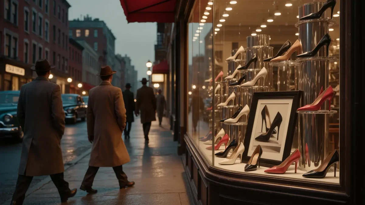
Andy Warhol became famous for mechanical repetition, but repetition was first a paycheck: from his arrival in New York in 1949 until roughly 1960 he worked as a commercial illustrator, and in 1955 his hand-coloured portfolio of blotted-line shoe drawings, À la recherche du shoe perdu — sixteen sheets lettered by his mother, Julia Warhola — made his touch the most recognisable in American advertising, mostly through weekly ads for the shoe manufacturer I. Miller. A decade before the Factory, before the silkscreen, before the famous people, he was already an image factory of one.
What exactly was the blotted line?
The blotted line — a drawing technique in which an original sketch is traced in wet ink onto nonabsorbent paper and pressed against a second sheet, producing a fragile, slightly misregistered copy rather than a clean duplicate — was Warhol's signature method through the 1950s. The imperfection was the point. Each press yielded wobbles, skips and pooling that no steady hand could fake, and the result sat between drawing and print: a picture that visibly carried its own reproduction inside it. Working cheaply and quickly, he could offer clients variations on a motif by pressing the same line again and again, a commercial logic that anticipates the silkscreen — a printing process that transfers an image through a stencil, one pass per colour — he adopted around 1962. Museum accounts of the technique, including those of the Museum of Modern Art, stress that the clumsiness is deliberate: the line is allowed to fail slightly, and the failure is what looks alive.
Who was I. Miller, and why shoes?
I. Miller was an American shoe manufacturer whose advertisements ran as a fixture of the New York papers, and from the mid-1950s Warhol supplied its campaign drawings at a near-weekly clip — so consistently that the association became a calling card for the whole industry. Shoes suited him for unglamorous reasons: they were a small, shapely, endlessly repeatable object that a page could carry week after week without boredom, and their drawing allowed the blotted line's wobbling contour to do what contour does best, which is to describe elegance with a tremor in it. His shoe drawings of the period are usually embellished with gold-leaf and hand-painted colour by studio assistants and with eccentric captioning by his mother, whose amateurish script — misspellings included, kept in — gave the ads their second signature. By the end of the decade he had also drawn footwear and fashion vignettes for magazines and retailers, and industry recognition followed: awards from the Art Directors Club, the trade body that juried commercial illustration, for work that millions of readers saw and almost nobody attributed.
How commercial was the commercial decade?
Thoroughly, and from the first minute. Warhol graduated from the Carnegie Institute of Technology in 1949 and moved to New York that same year; his first published illustration appeared in Glamour magazine in September 1949, accompanying an article titled “Success is a Job in New York.” Through the 1950s he drew for fashion magazines and department-store accounts, ran a studio with hired colourists who filled in his blotted lines the way a print shop fills in plates, and by decade's end was earning a comfortable middle-class living — an irony often lost on accounts of the destitute genius, since the future prince of the avant-garde was, by the standards of 1959, a successful small businessman. He also assembled book-like promotional portfolios, of which À la recherche du shoe perdu — the title puns on Proust, À la recherche du temps perdu — is the best known, distributed to clients and reprinted later as evidence that his “commercial” work was his most delicate.
When did commerce turn into Pop?
The pivot came between 1960 and 1962, as he began moving images from advertising into gallery context — first hand-painted cartoon and newspaper figures, then, in 1962, the Campbell's Soup Cans, thirty-two canvases shown at the Ferus Gallery in Los Angeles that famously presented soup labels as portraiture. What is easy to miss is that the new work did not abandon the old method so much as enlarge it. The blotted line had already taught him that a slight, mechanical misregistration makes an image more seductive, not less; the silkscreen simply industrialised the insight, letting a photograph of Marilyn Monroe or a car crash be repeated until the misalignments accumulated into pathos. The shoe drawings were the prototype: a mass-produced object, lovingly defaced by the accident of reproduction, signed by hand. The Factory — the studio he ran from 1964 as an open, assist-staffed production line — is usually told as a break with his commercial past, but it reads more honestly as that past with the volume turned up.
Why does the illustration decade matter to fashion?
Because it collapses the wall that fashion imagery still pretends to maintain between art and selling. Warhol spent his twenties making pictures whose only ambition was to sell shoes beautifully, and whose unintended legacy was a demonstration that the marketplace and the museum share a mechanical palette. “Business art is the step that comes after Art,” he wrote much later, in The Philosophy of Andy Warhol (From A to B and Back Again), published in 1975 — a sentence that reads as a confession only if the 1950s are skipped. For anyone who looks at fashion illustration today, the decade argues that the commercial image is not art's poor cousin but its rehearsal space: the place where a drawing style is stress-tested against deadlines, clients and the public, until only the seductive survives. The Factory was built on shoes. They fit perfectly.