When Hedi Slimane took over Céline in 2018, his first public act was typographic: the house name shed its acute accent, its petite spelling and its Phoebe Philo-era restraint, re-emerging as an all-caps CELINE wordmark that Slimane adapted from a 1960s version in the brand's own archive. No garment had yet been shown. The episode is the clearest recent proof of what a rebrand actually changes first — not the clothes, which follow a year later, but the type: the smallest, cheapest and most consequential surface a fashion brand owns.
What does a logo change actually signal?
A new wordmark is a declaration of regime change. Because a fashion house's logo is the one element every consumer touches — embossed, embroidered, printed on bags, screens and shopfronts — resetting it tells the market that everything downstream has changed authority, before a single review can intervene. It also resets the archive's copyright: a redrawn wordmark is new intellectual property, and it legally and visually separates the incoming designer's products from the outgoing era's. Slimane had demonstrated the playbook at Saint Laurent in 2012, where the house became Saint Laurent Paris under a wordmark designed with Peter Saville, and the controversy that greeted the change was, functionally, the change announcing itself.
Why did houses suddenly hire graphic designers?
Because the 2010s made type a competitive surface. Peter Saville — the Factory Records designer whose Joy Division sleeves are canonical — was commissioned for Saint Laurent in 2012 and again by Burberry in 2018, when Riccardo Tisci arrived and the house replaced its famous equestrian knight with a sans-serif wordmark and a monogram. The hiring of art-school graphic designers signalled a change in self-understanding: a fashion house now conceived itself as an image system, and was willing to pay a named author to rebuild the system's foundation. Balmain likewise modernised its branding in the same period, part of a wave in which heritage houses traded crest for clean type.
The uniform sans-serif problem
Critics noted, with reason, that the wave produced a convergence: all-caps, letterspaced, near-identical sans serifs across houses, the luxury equivalent of the tech industry's flat rebrands. The uniformity is not incompetence but strategy — the same reduction that made mid-century-modern type desirable, read at a glance as expensive, detached and current. The counter-argument is that legibility is the point: on a phone screen the size of a stamp, a wordmark's job is to be instant, and the century of ornament a crest carried does not survive compression. Both positions are true, which is why the debate never resolves.
What does a rebrand actually change — and what survives?
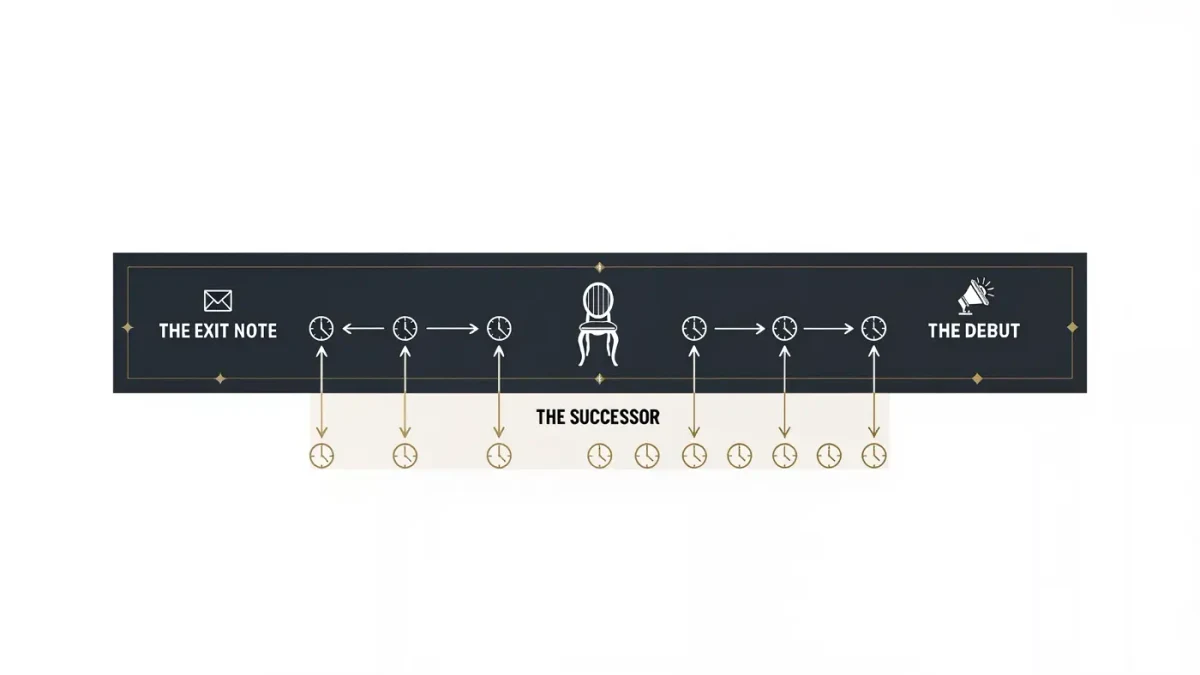
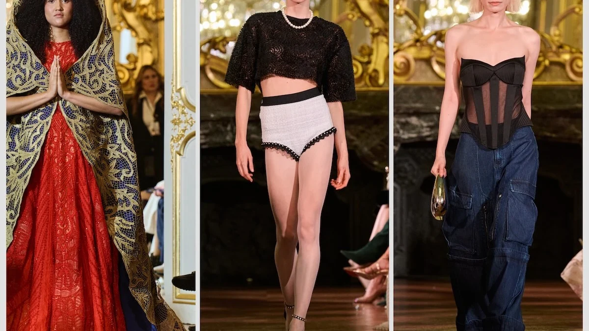
The honest inventory: a rebrand changes the visible skin instantly, the products within a year or two, and the accumulated meaning slowly, if at all. Customers who bought Céline under Philo did not transfer their loyalty to CELINE automatically, and archival pieces from the previous era gained, rather than lost, value precisely because the wordmark periodised them. Typography can name a new era, but it cannot author the era's content — that remains the work of collections, campaigns and stores over years. What the 2018 example proved is sequencing: the type comes first because it is the cheapest announcement, the fastest to deploy, and the only change every stakeholder must absorb on day one.
Is the logo still the brand?
Less than its designers hope, more than its critics admit. A wordmark is infrastructure — the fixed frame within which campaigns, collaborations and collections vary — and infrastructure gets attention only when it breaks, as each of these rebrands demonstrated by breaking loudly. The type changes in 2012 and 2018 were effective precisely because they were read as sentences about power: who now speaks for this house. Fashion's logos will keep being redrawn with every change of regime, and the graphic designers who draw them will keep getting named, because the industry has learned what the first public act of any new authority should be: change the lettering on the door.
How does a typography change reach the customer?
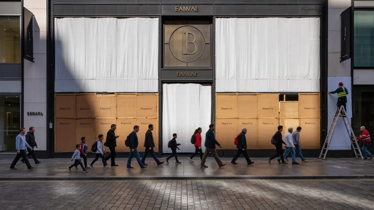
Faster than any collection can. A wordmark is deployed across packaging, e-commerce, social avatars, shopfront fascias, tissue paper and garment labels in a single coordinated week, which is why the change is experienced as an event even though nothing yet differs materially. Employees must be briefed, wholesale partners re-supplied, and counterfeits — which copy the old mark faithfully — suddenly made legible as fakes, a practical benefit houses rarely advertise. The typography also disciplines the incoming designer: an all-caps sans-serif world implies certain proportions, certain materials and a certain camera distance, so the rebrand quietly pre-formats the collections that will follow it.
What should a reader take from the 2018 wave?
That a logo is a sentence about power, and the reader's job is to read it sceptically. When a house changes its lettering it is telling you who is now in charge, and asking you to believe the change is deeper than the surface — sometimes true, sometimes a substitute for it. The durable lesson of Céline 2018 and its predecessors is sequencing and restraint: type is the first and cheapest instrument of creative direction, deployed in days where collections take months, and it works best when it makes a claim the following seasons can honour. Judged that way, the wave of redrawn wordmarks was neither vandalism nor renaissance, but the industry learning to write its transitions in the most condensed form it possesses.