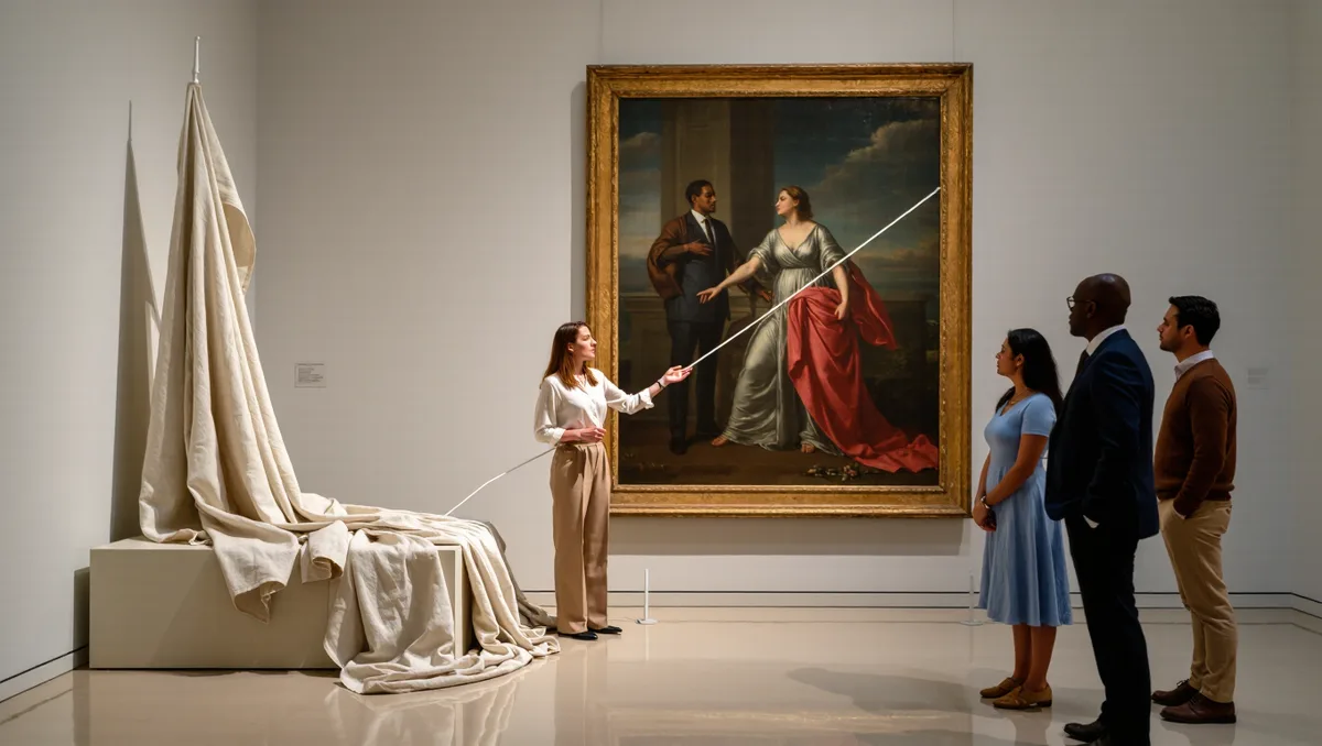
Reading a painting is a skill, not a gift. It means looking in a deliberate order: first the whole, then the parts, then the connections between them. Anyone can do it in ten minutes, and no art history degree is required.
The word itself gives the method away. To read, in the oldest sense, is to interpret — to look at something and make sense of it. Wiktionary traces the English verb back to the Old English rǣdan, which meant to counsel, advise and interpret before it ever meant to decode letters. A painting is simply another text written in shape and color instead of words, and it can be read the same way: slowly, in order, with attention to what sits where.
This guide walks through that order in five steps. Each one asks a single question of the canvas. Together they turn a vague feeling of liking or not liking into an actual argument about what the picture means.
What do you look at first: the whole picture or the details?
Start with the whole. Give the painting one long, silent look before you name anything. Notice your first impression — calm, uneasy, crowded, empty — and hold onto it. That first response is data. Painters arrange every element to produce it.
Then ask where your eye goes first. Every composition has a doorway: the brightest patch, the sharpest edge, the one face turned toward you. Artists build that doorway on purpose. Once you find it, follow your eye's path from there. Where does it travel next? Where does it stall? A good picture moves the eye in a loop; a weak one lets it slide off the edge.
Only after the whole makes sense should you go hunting for details. Details read differently once you know the picture's route, because you see them as stops along the way rather than as isolated facts.
How does composition tell the story?
Composition is the arrangement of shapes on the flat surface — where things sit, how they balance, what lines connect them. Squint until the painting blurs into abstract shapes. This is the fastest trick in the beginner's kit, because it strips away subject matter and shows the skeleton underneath.
Ask three things of that skeleton. Is it symmetrical or lopsided? A balanced, centered arrangement tends to feel stable and official; a tilted, crowded one feels tense or in motion. Are the main shapes horizontal, vertical or diagonal? Horizontals rest, verticals stand, diagonals move. And is there depth, or is the picture flat? Some painters build deep illusionistic space you could walk into; others press everything against the surface and remind you that this is, in the end, cloth and paint on a flat board. Neither choice is better. Each one is a decision about what the picture wants you to believe.
When a designer borrows a painting, it is usually the composition they borrow. The way Yves Saint Laurent lifted the color blocks of a Mondrian painting onto a dress is the classic case — the grid, not the subject, was the idea. Our piece on the Mondrian dress follows that borrowing in detail. This connects to our earlier piece, The Grid and the Body: How Yves Saint Laurent Turned a Mondrian Painting Into a Dress.
What is color actually doing?
Color carries mood before it carries meaning. Ask first whether the palette is warm or cool, loud or muted, and whether one color dominates. A picture built on two colors reads very differently from one built on forty.
Then look for contrast. The eye goes to the sharpest difference on the canvas — a red coat in a grey street, a pale face against a dark ground. Painters use contrast the way writers use emphasis: it tells you what matters. Find the highest contrast in the picture and you have usually found the subject.
Color can also be the whole subject. In the paintings of Mark Rothko, there is no figure and no story to find — only stacked fields of color tuned to produce a feeling. That is not a lesser kind of painting; it is a different instrument. Our essay on Rothko and the minimalist coat looks at how that instrument traveled into fashion. When you meet a picture with no recognizable objects, read the color as you would read a sentence: what is it claiming, and how loudly?
What do the symbols mean — and how do you check?
Symbolism is where beginners worry most, and where the honest answer is simplest: you cannot decode every symbol, and you do not need to. Some meanings were common knowledge in the painter's world and are obscure in ours. A skull meant mortality; a dog often meant loyalty; a wilting flower meant time passing. Others are private to the artist and may never be fully recoverable.
What you can do is notice. Notice the objects the painter bothered to include, especially the odd ones. Why is there a lemon half-peeled on the table? Why is the mirror reflecting something that is not in the room? An object that does nothing practical in the scene is usually doing symbolic work. Name what you see before you name what it means. Half of misreading comes from seeing a lute and calling it a guitar.
When a symbol puzzles you, check rather than guess. Museum labels, collection catalogues and the artist's own statements are the honest sources, and a claim you cannot trace is a hunch, not a reading. The same discipline applies to fashion's borrowings from art: when a house says a collection references an artist, that claim deserves a named source, as our coverage of Schiaparelli and Dalí's surrealist collaborations tries to model. Pattern, too, can be ideology rather than decoration — the wallpaper of William Morris carried arguments about work and beauty that our Morris essay unpacks. For related coverage, see Patterns With a Conscience: William Morris's 19th-Century Motifs and Fashion's Long Borrowing.
How do context and title change the reading?
Two last tools, both cheap. First, the title. Painters and patrons title pictures to steer the reading, and the steer is part of the work. Read the title before the label, then ask what the title makes you notice that you missed. A picture called Portrait of a Lady and the same picture called The Debt are two different experiences.
Second, the date and place. You do not need a history lecture — just ask what was happening in that world when the picture was made, and what the painter was reacting to or against. A portrait painted in a wealthy court and one painted in a year of revolution use the same genre to very different ends. Even the repetition of a single motif can carry this historical weight: Yayoi Kusama's dots, which our profile of Kusama's career traces from her early happenings to a luxury collaboration, mean something different in each decade she deployed them.
Context also tells you when to stop. A reading that requires the painter to have known things from a century later is not a reading. Stay inside the picture's own time and your argument will stay defensible.
What this means: a five-step method you can use in any gallery
Put together, the method is short enough to run in your head at any exhibition:
- Whole first. One long look. Note your gut response.
- Find the doorway. Where does the eye enter, and where does it travel?
- Squint for the skeleton. Balanced or tilted? Deep or flat?
- Read the color as argument. What dominates, what contrasts, what is it claiming?
- Name the objects, then check the symbols. Notice the odd details; verify meanings rather than guessing them.
Then, and only then, read the wall label. The label confirms, corrects or complicates what you found — but it should never be the first voice you hear. The point of learning how to read a painting is not to pass a test. It is to stand in front of an image and have something of your own to say about it, and to know which parts of what you say are observation, which are inference, and which you would need a source to defend. That habit of separating what you see from what you assume is the whole discipline, and it transfers everywhere: to the next exhibition, to the next collection, and to the clothes on your back, which are paintings that move.